With a brand transformation and over 30+ product launches, Logitech G has become one of the most recognized and trusted names in the gaming industry.
LOGITECH G PACKAGING
A Collection of Work for Logitech Gaming

Packaging
Learnings / Considerations / Constraints
As we see an increased trend in online purchases, with an increasing number of marketing campaigns driven towards social media, the role of packaging also needed to adapt to reflect these changes. The role of the consumer has changed dramatically, as access to information, product reviews, and testimonials are easily accessible, allowing for more educated purchases and decisions.
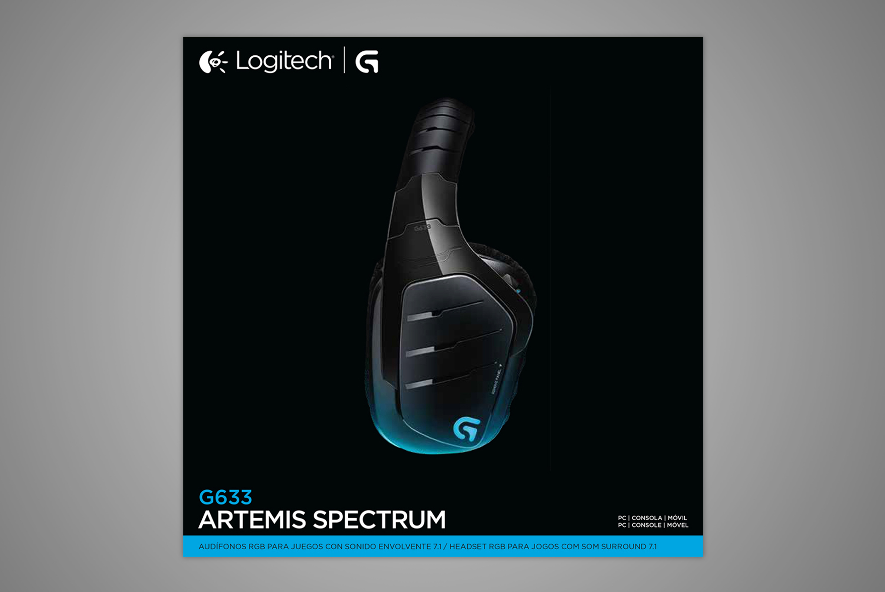
Prior to the rebranding effort, Logitech leveraged several graphic elements with complex backgrounds, x-rays, and glows in order to tell a story. At times, the product would feel hidden behind these graphic elements and marketing copy. Given the new role of the educated consumer, our solution relied on celebrating the beauty of the product itself, while eliminating the unnecessary graphic elements.


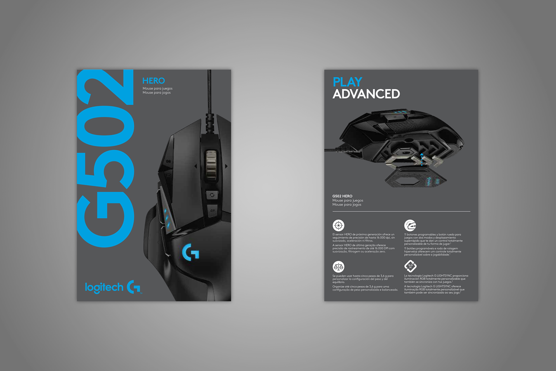
The market responded well to the bold and confident productcentric approach, prompting an immediate increase in product development. As the brand coalesced, the product portfolio grew rapidly, with many products coming to fruition with subtle and almost indistinguishable differences, and creating several new issues.
Wired or wireless? Bluetooth or unifying? Leatherette or cloth? Cherry MX or Romer-G? Tactile or linear? With so many variations in features, the proposed solution resulted in a tiering system, further unifying the brand, and allowing consumers to differentiate between different product categories and their individual needs.

The strategy behind leveraging a tiering system allows for a good, better, best segmentation, grouped by price and features, as represented on shelf. Apart from helping the consumer in navigating through the product line, one of the stronger arguments and compelling benefactors for using an icon based tiering system, is not having to rely on heavy amounts of supporting copy, especially during localization, where multiple lines of text is required for specific countries and regions.
Unfortunately, iconography was not included as part of the overall rebranding campaign, leaving the team with inconsistent and outdated icons. While Logitech had increased its design awareness, it lacked a comprehensive icon library for the rapidly growing businesses. The solution was reached by completing a packaging audit, developing a grid-based system, eventually prompting the iconography project and the extensive creation of over 275+ new icons.