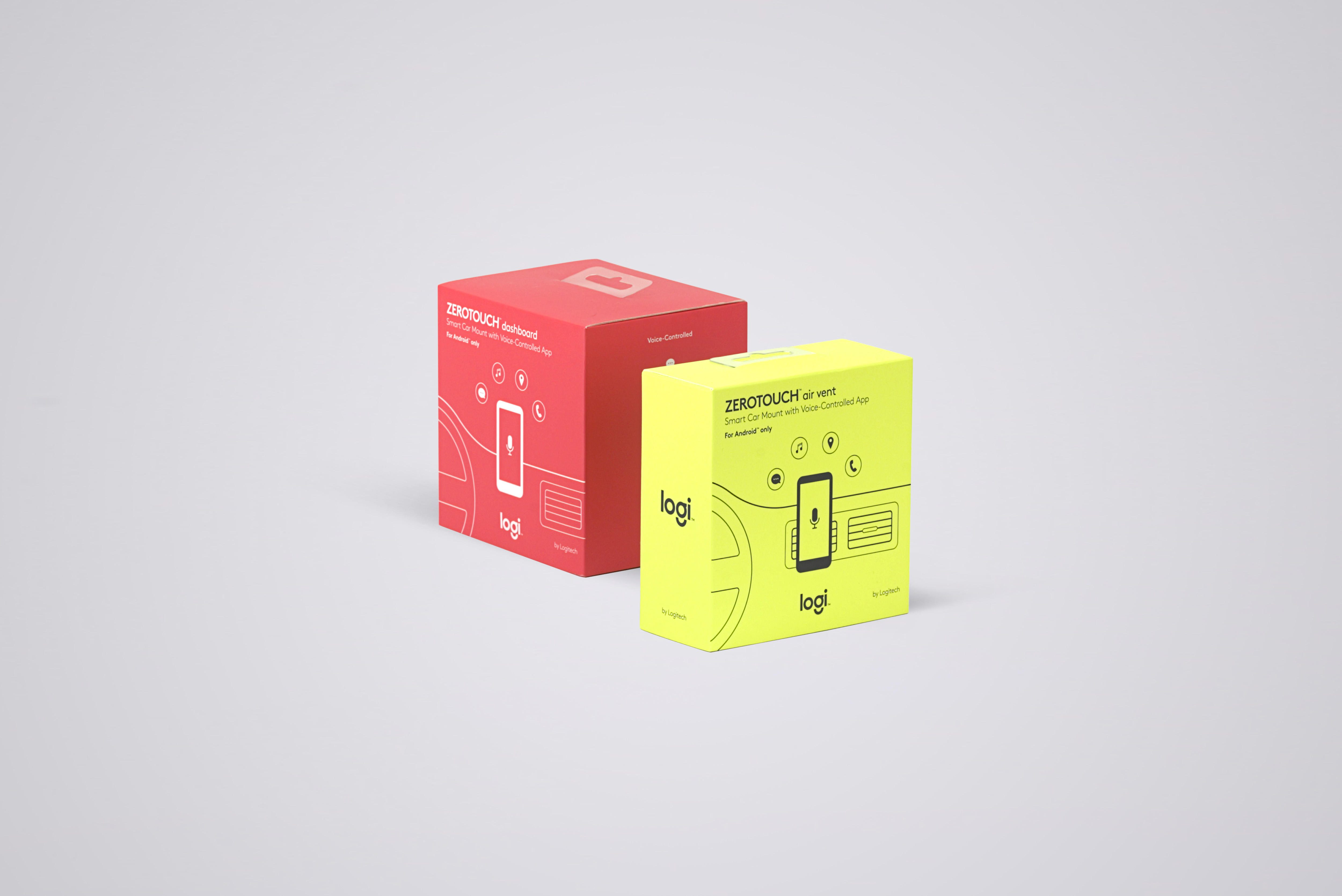
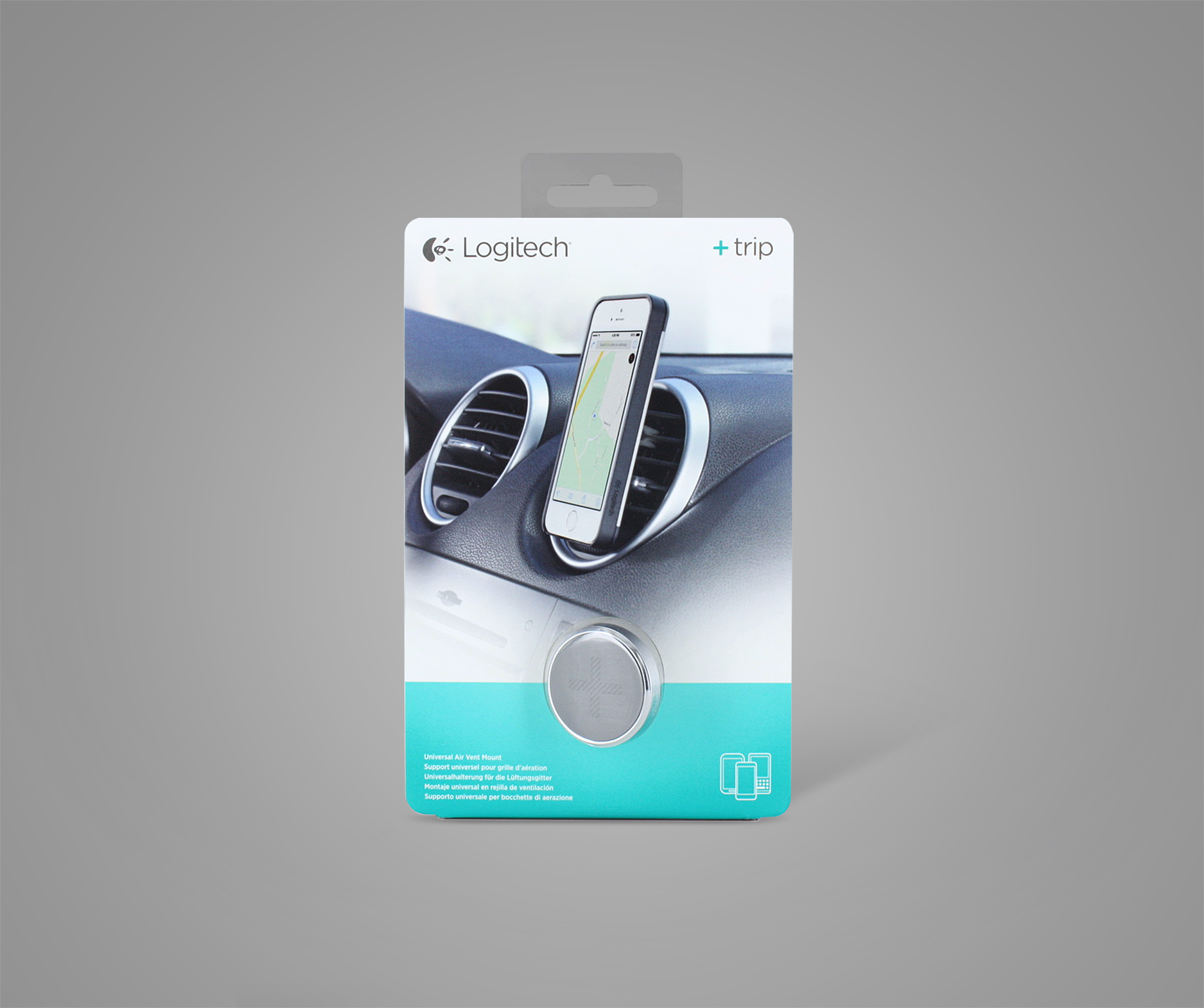
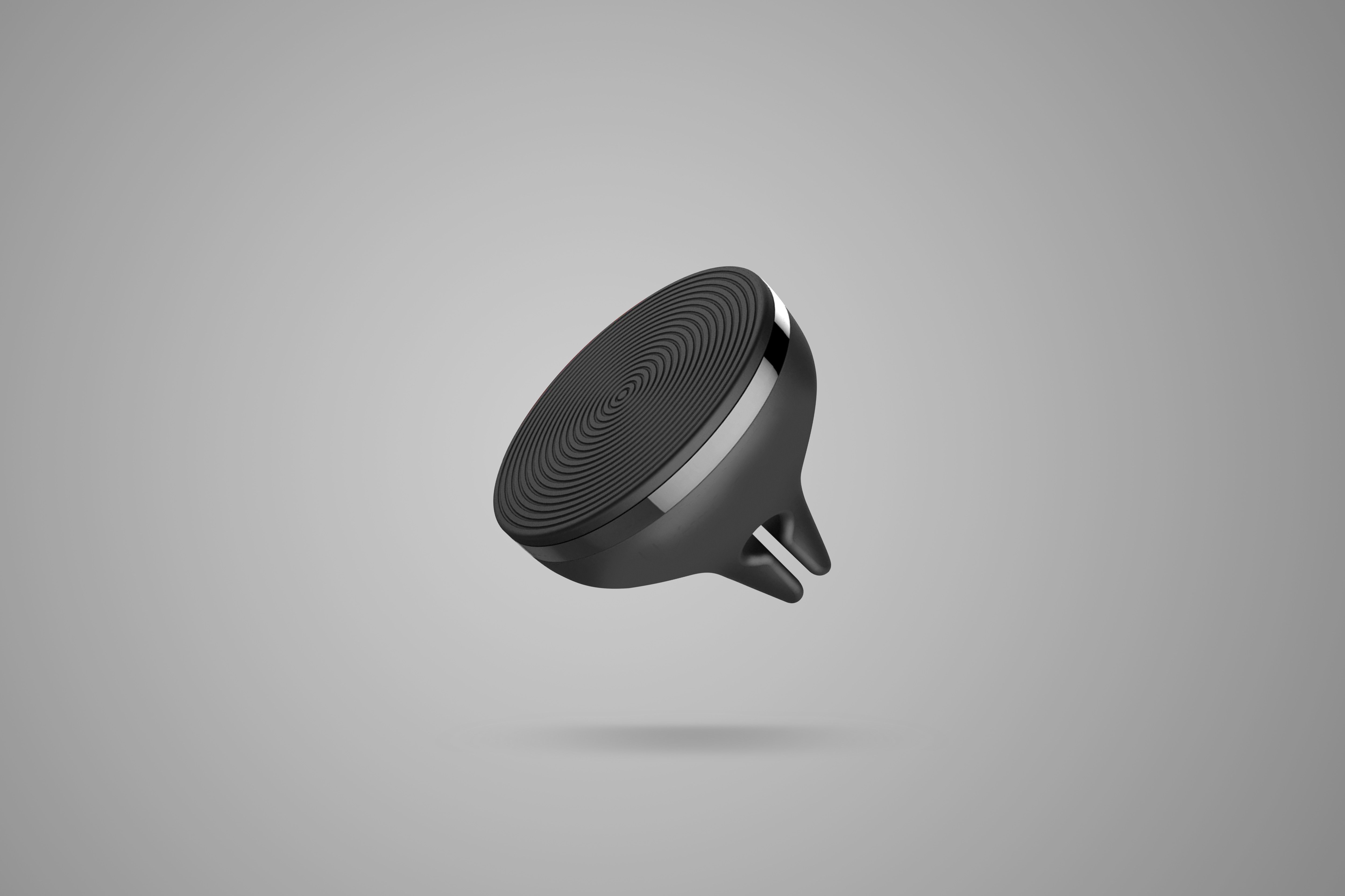
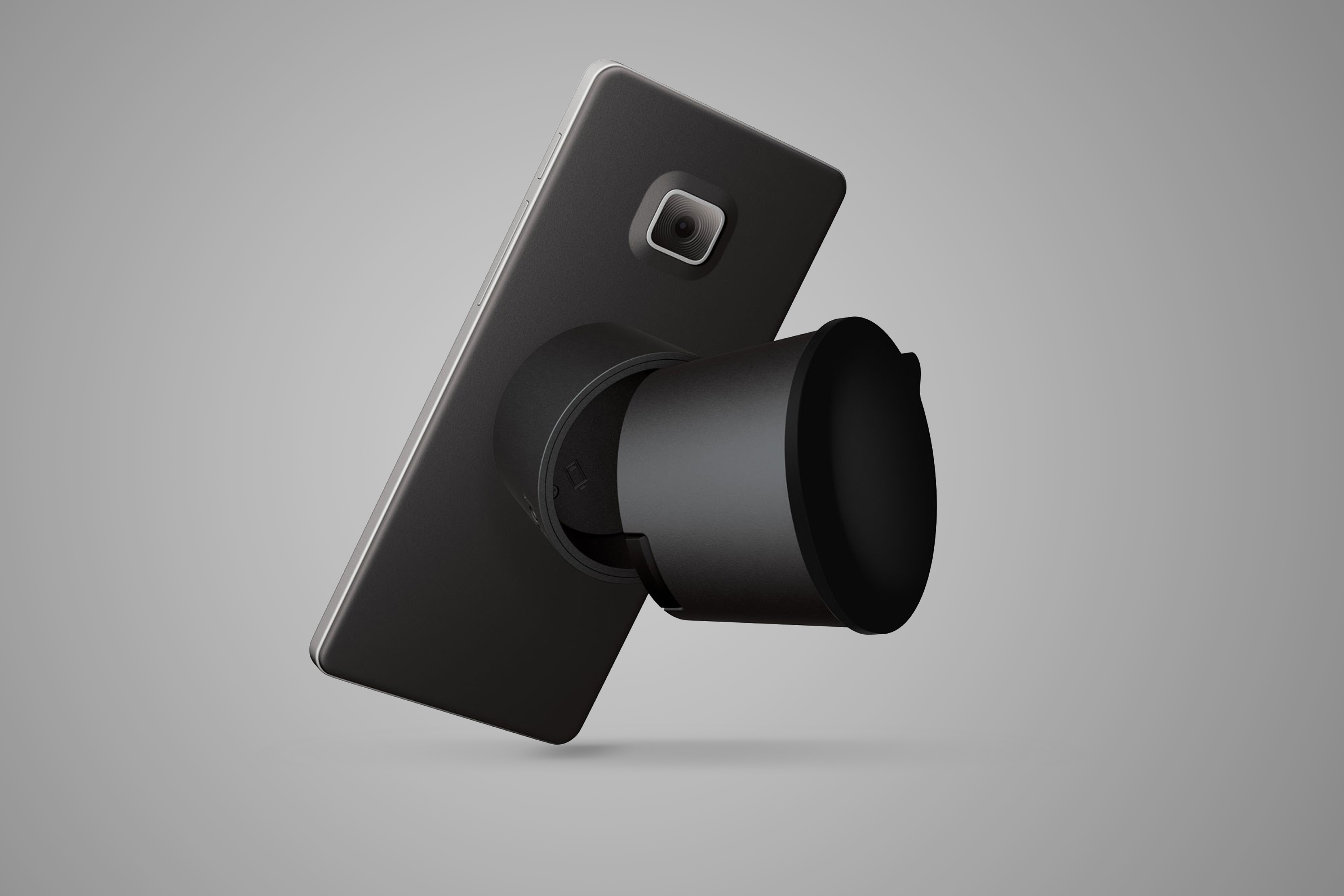
Opinions, debates, and countless packaging explorations for a transitional project.
LOGITECH ZEROTOUCH
Hands-Free Car Mount with Amazon Alexa
Packaging
Learnings / Considerations / Constraints
It’s not uncommon for internal team members to stop by, discuss work challenges, and report on overall status and progress. Given these opportunities, team members would be given a chance to see design work in progress and often prompted for feedback. In this case, the collective response was,” It looks beautiful, but what does it do?”
Zerotouch is a phone mount for your car with integrated speech recognition technology, allowing consumers to operate their phones using only their voice. While the concept of hands-free phone integration isn’t new, the challenge of communicating both hardware and software features in a single image proved to be difficult.
Accessories
Chargers / Mounts / Cable Extenders
There is an unspoken language that has been established between buyers and sellers in a retail environment that has developed over time. As people continue to adopt and incorporate technology into their everyday lives, the educated consumer no longer relies on visual cues into what a keyboard or mouse does, as there is an inherent understanding as to what these products do.
Obviously, this was not the case with this product, as the decision was made to forego showing the product image on the front, in lieu of showing the use case. The design team was torn, as some felt the product was iconic and deserved to be represented on the front of the box, while others felt the product would always be hidden while in use, making the functionality take precedent.


