A small group of creatives working to change, define, and refresh an evolving brand.
LOGITECH REBRANDING
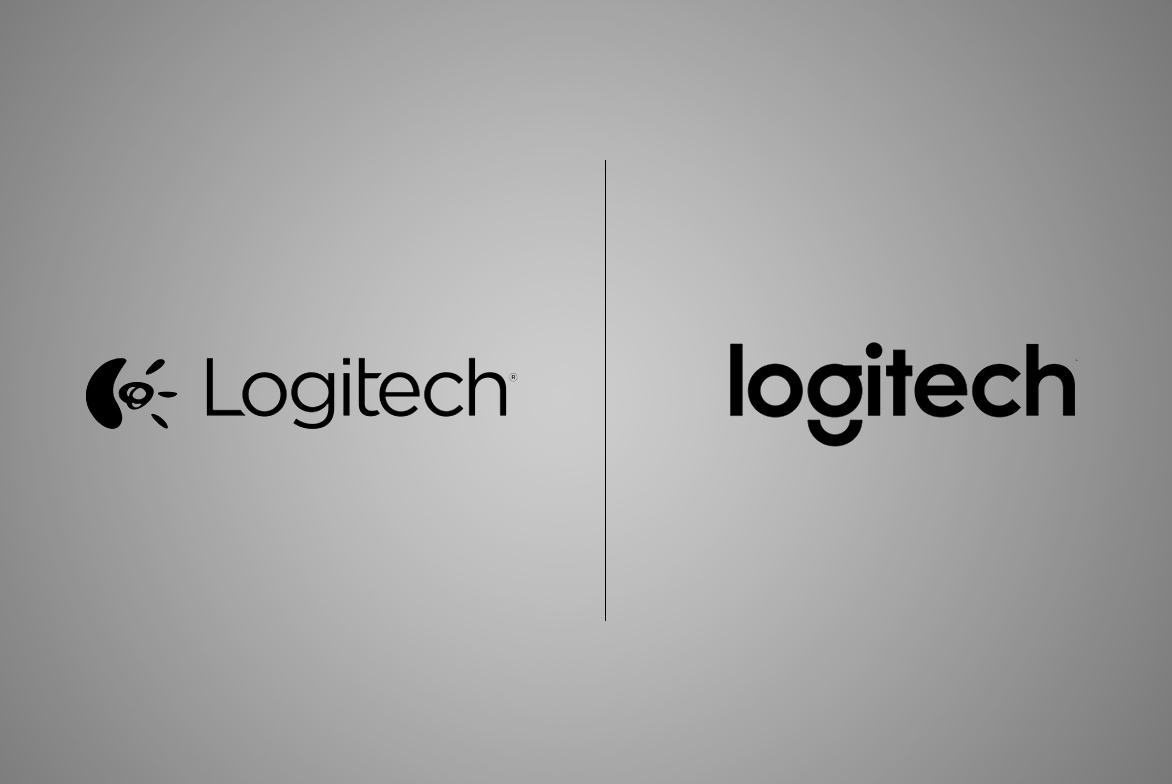
The transformation into a design driven company
Packaging
Learnings / Considerations / Constraints
Able to see the value in delivering excellent products in a beautiful form factor, Logitech was in need of a change to reflect this new attitude. Once a new look had been established, it was the internal design team working together to bring the uplift to the retail market.
Prior to the change, Logitech had been accustomed to telling a product story through use of situational imagery, complicated backgrounds, X-rays, or complex diagrams. The new brand eliminated all of the superfluous graphical elements, leaving only the product to be admired, and a lasting impression of confidence.
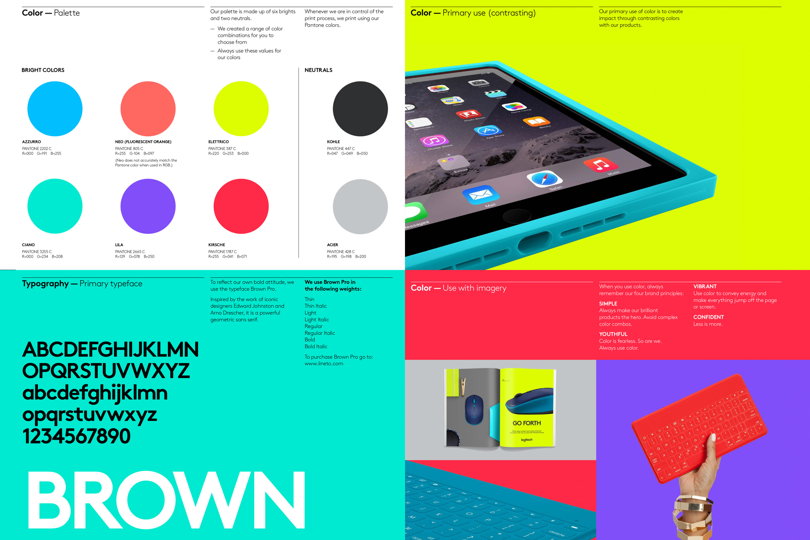
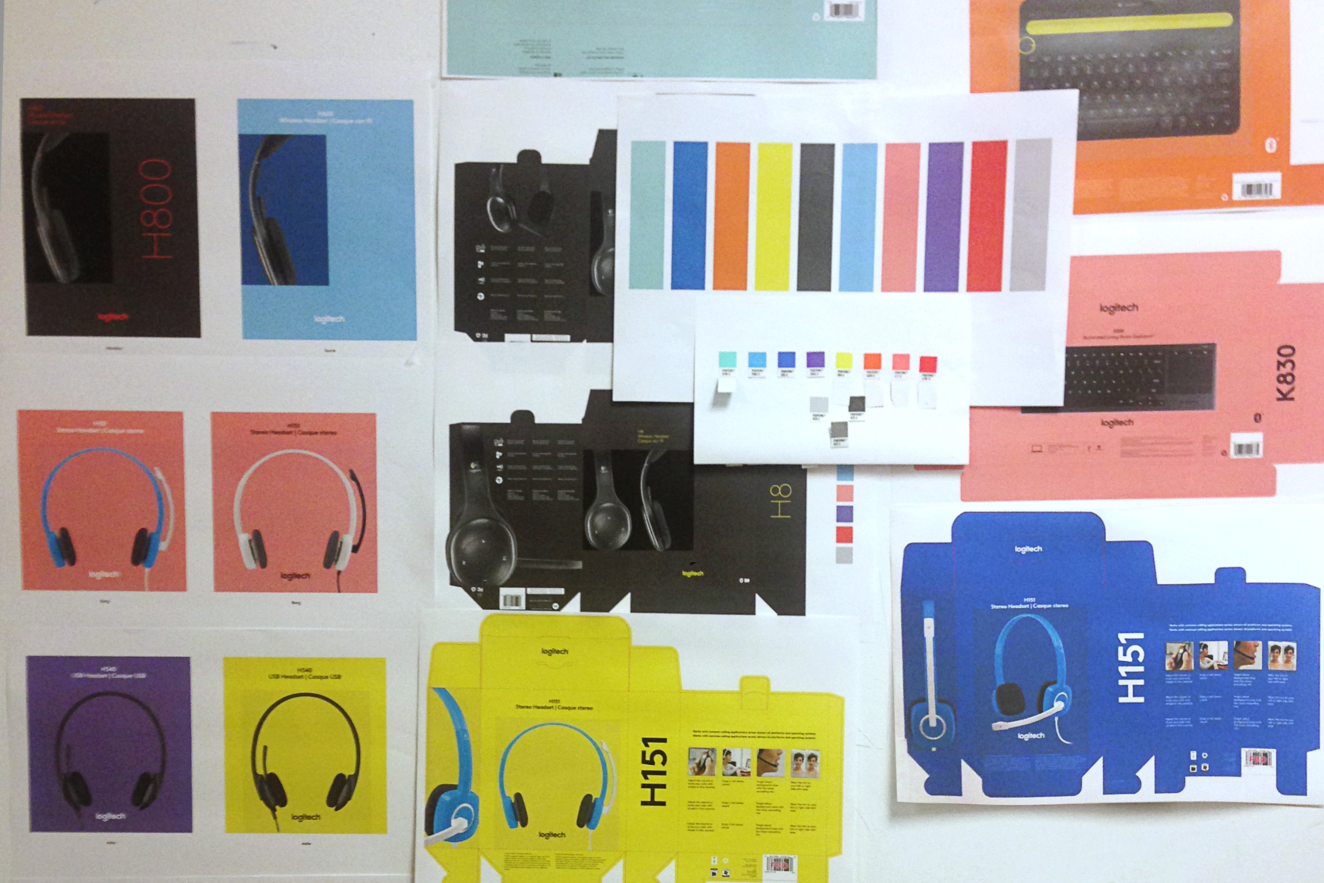
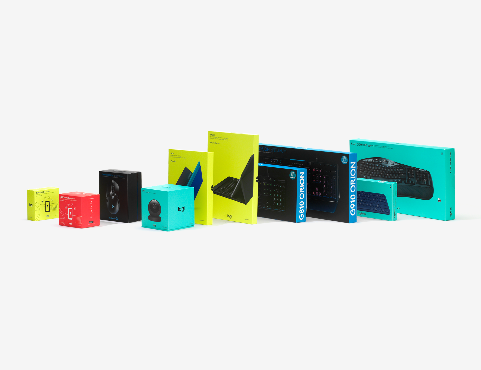
The company had shifted it’s focus on creating a recognizable brand using eight new Pantone colors, utilizing the packaging to create an impactful wall of color in the retail environment. Body copy, sizing, and legibility were also addressed, increasing significantly in size, with a new typeface to help elevate the brand.
Logo sizing, placement, and color usage were further developed and refined, eventually becoming a part of the extensive brand guidelines. The market responded well to the changes, as the Logitech design team continued to grow, as more and more products were being created.
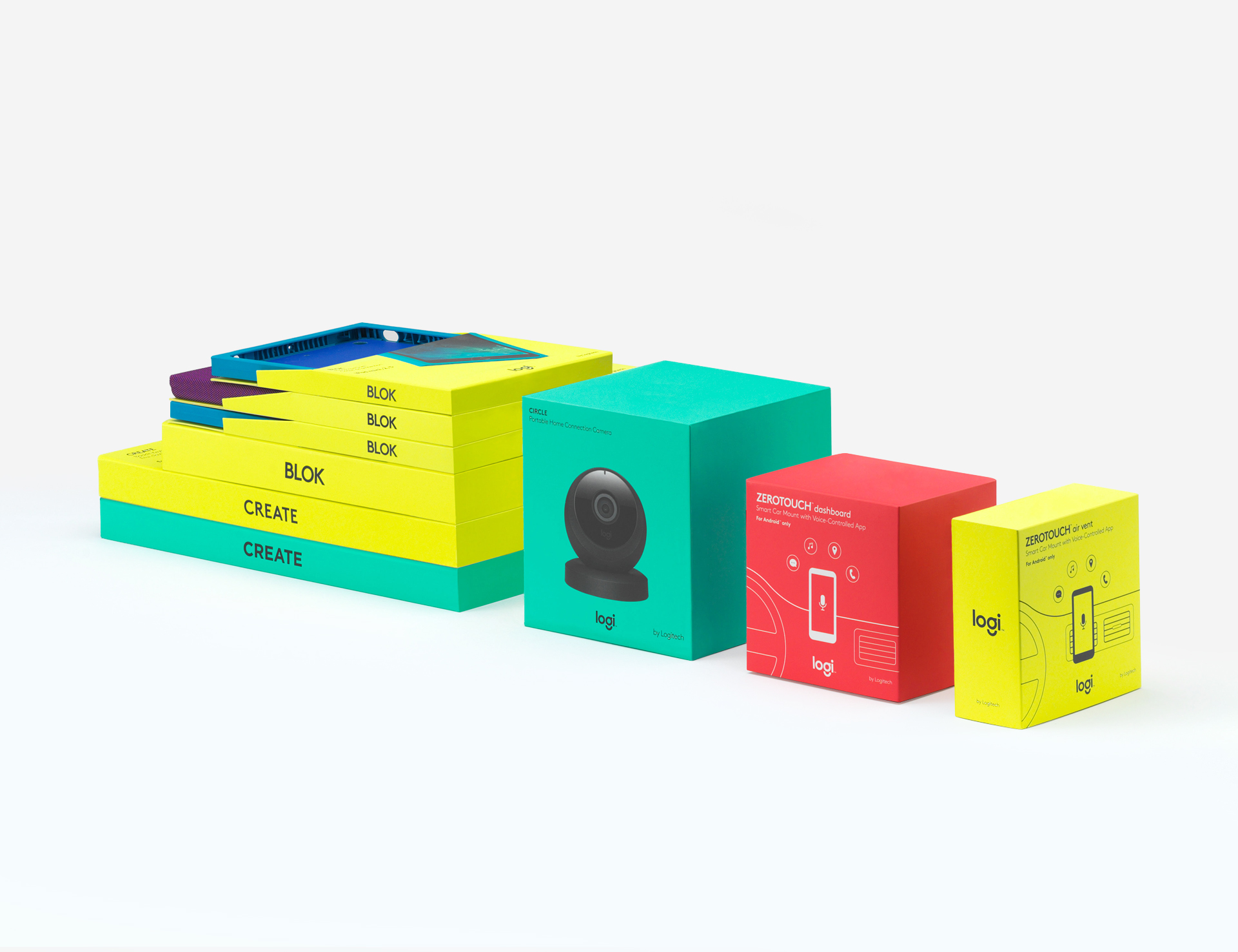

As the portfolio grew rapidly, a product tiering system was also implemented, creating good, better, best product categories, allowing consumers to differentiate between specific products and their individually tailored needs.
With the new brand uplift, Logitech has been able to reach a much wider audience with it’s refreshing new attitude and design ethos. As a result, the Logitech stock has increased 500% within the last five years of the company’s transformation.